移动端页面、导航条响应
- 移动端页面
- 项目搭建
- 实现效果
- 实现代码
- 导航条响应
- 项目搭建
- 实现效果
- 实现代码
- less部分代码参考
- HTML代码参考
移动端页面
项目搭建
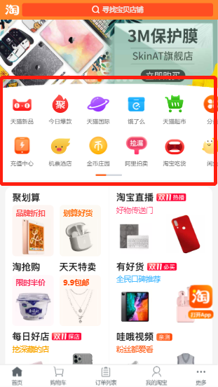
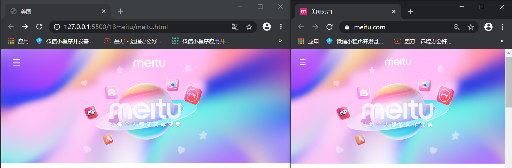
实现效果
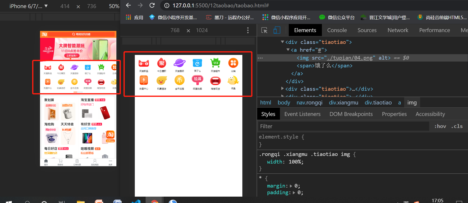
实现代码
这里引用图片均在官网下载,放在和本.html同级目录下
<!DOCTYPE html>
<html lang="en">
<head>
    <meta charset="UTF-8">
    <meta name="viewport" content="width=device-width, initial-scale=1.0">
    <title>移动端页面</title>
    <style>
        *{
            margin: 0;
            padding: 0;
        }
        a{
            text-decoration: none;
            color: #333;

            size: 12px;
        }
        /* 设置外层容器 */
        .rongqi{
            width: 100%;
        }
        /* 设置每一行的容器 */
        .rongqi .xiangmu{
            /* 设置为弹性容器 */
            display: flex;
            justify-content: space-around;
        }
        .rongqi .xiangmu .tiaotiao{
            /* background-color: blue; */
            width: 17%;
            text-align: center;
        }
        .rongqi .xiangmu .tiaotiao img{
            /* 设置图片的宽度和父元素一样 */
            width: 100%;
        }
    </style>
</head>
<body>
    <nav class="rongqi">
        <div class="xiangmu">
            <div class="tiaotiao">
                <a href="#">
                    <img src="./tupian/01.png" alt="">
                    <span>天猫新品</span>
                </a>
            </div>
            <div class="tiaotiao">
                <a href="#">
                    <img src="./tupian/02.png" alt="">
                    <span>今日爆款</span>
                </a>
            </div>
            <div class="tiaotiao">
                <a href="#">
                    <img src="./tupian/03.png" alt="">
                    <span>天猫国际</span>
                </a>
            </div>
            <div class="tiaotiao">
                <a href="#">
                    <img src="./tupian/04.png" alt="">
                    <span>饿了么</span>
                </a>
            </div>
            <div class="tiaotiao">
                <a href="#">
                    <img src="./tupian/05.png" alt="">
                    <span>天猫超市</span>
                </a>
            </div>
            <div class="tiaotiao">
                <a href="#">
                    <img src="./tupian/06.png" alt="">
                    <span>分类</span>
                </a>
            </div>

        </div>
        <div class="xiangmu">
            <div class="tiaotiao">
                <a href="#">
                    <img src="./tupian/11.png" alt="">
                    <span>充值中心</span>
                </a>
            </div>
            <div class="tiaotiao">
                <a href="#">
                    <img src="./tupian/12.png" alt="">
                    <span>机票酒店</span>
                </a>
            </div>
            <div class="tiaotiao">
                <a href="#">
                    <img src="./tupian/13.png" alt="">
                    <span>金币庄园</span>
                </a>
            </div>
            <div class="tiaotiao">
                <a href="#">
                    <img src="./tupian/14.png" alt="">
                    <span>阿里拍卖</span>
                </a>
            </div>
            <div class="tiaotiao">
                <a href="#">
                    <img src="./tupian/15.png" alt="">
                    <span>淘宝吃货</span>
                </a>
            </div>
            <div class="tiaotiao">
                <a href="#">
                    <img src="./tupian/16.png" alt="">
                    <span>闲鱼</span>
                </a>
            </div>

        </div>
    </nav>
</body>
</html>
导航条响应
项目搭建
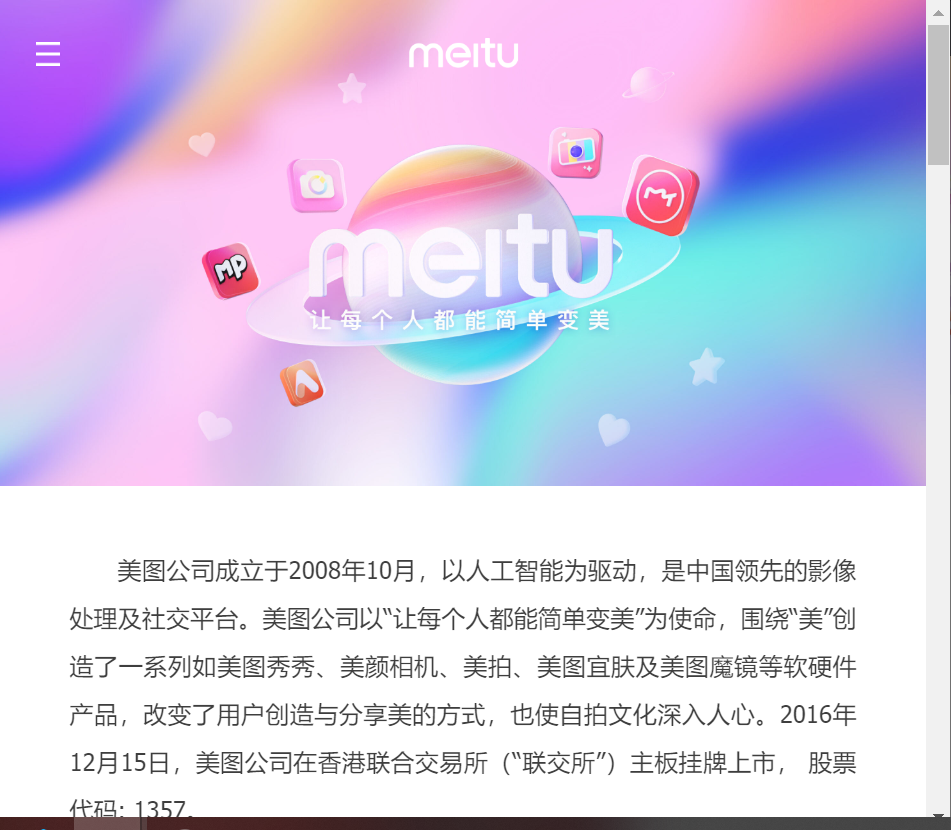
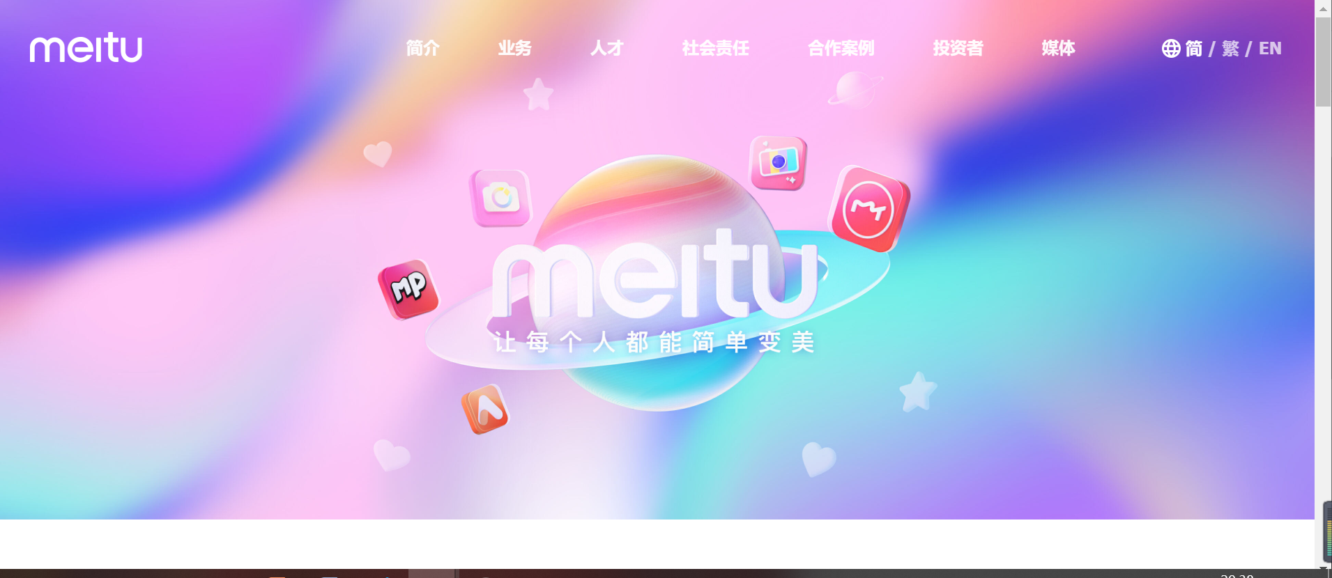
实现效果
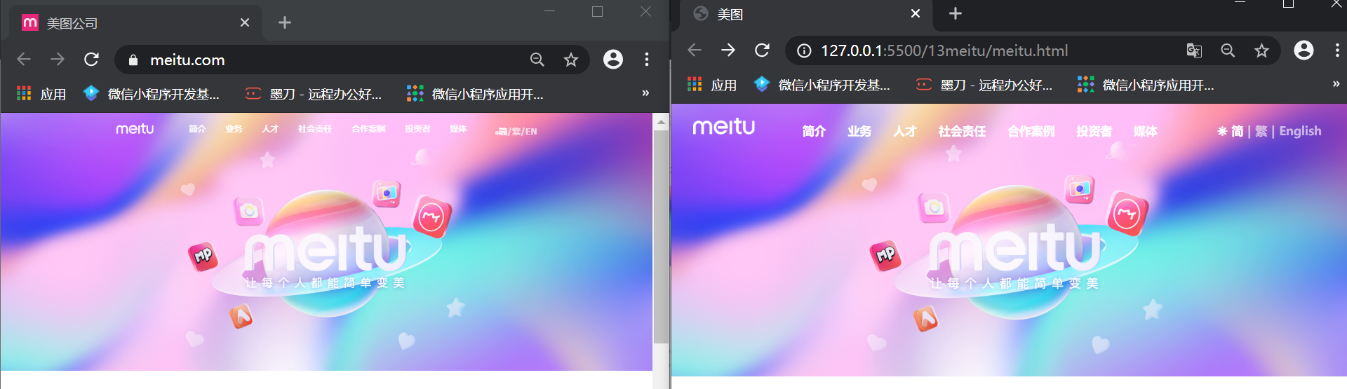
实现代码
这里引用图片均在官网下载,放在和本.html同级目录下,
本文是在引用了reset.css文件去除浏览器默认样式的情况下进行的渲染,可参考day02-layout盒模型中浏览器的默认样式模块下的reset.css链接自行下载使用
这里将渲染写在外部.less文件中,通过自动生成的.css文件引入
此部分运用媒体特性;
less部分代码参考
 body {
        background-image: url(./tupian/02.png);
        background-repeat: no-repeat;
        background-size: cover;
    a {
            text-decoration: none;
            color: rgb(89, 89, 89);
            }
 .rongqi {
            align-items: center;
            display: flex;
            height: 64px;
            padding: 0 26px;
            justify-content: space-between;
            .zuotubiao:hover ~ .neirong,
            .zuotubiao ~ .neirong:hover{
                display: block;
            }
            .zuoce{
                .zuotubiao{
                    .dianqian{
                        position: relative;
                        z-index: 999;
                    }
                    .dianhou{
                        display: none;
                        color: rgb(131, 131, 131);
                        position: relative;
                        z-index: 99;
                    }
                    .dianqian:active{
                        display: none;
                    }
                    .dianqian:active ~ .dianhou{
                        display: block;
                    }
                    img{
                        width: 16px;
                        height: 16px;
                    }
                }
                 .neirong{
                        display: none;
                        flex-direction: column;
                        position: absolute;
                        top: 0;
                        left: 0;
                        right: 0;
                        width: auto;
                        height: 100%;
                        font-size: 20px;
                        background-color: rgb(255, 255, 255);
                        padding-top: 40px;
                        li{
                            height: 64px;
                            display: flex;
                            justify-content: center;
                        }

                        img{
                            width: 73px;
                            height: 20px;
                        }
                        span{
                            color: rgb(133, 133, 133);
                        }
                        span:nth-of-type(1){
                            color: rgb(89, 89, 89);
                        }
                        span:nth-of-type(2),:nth-of-type(4){
                            color: rgb(80, 80, 80);
                        }
                 }

            }
            .logo{
                img{
                width: 73px;
                height: 20px;
                }
            }
        }

 }
 @media only screen {
     @media (min-width:768px){
        body{
            .rongqi{
                justify-content: space-between;
                .zuoce{
                    color: #fff;
                    .zuotubiao{
                        display: none;
                    }
                    flex: auto;
                    .neirong{
                        order: 3;
                        display: block;
                        background-color: transparent;
                        padding-top: 0;
                        text-align: center;
                        width: 100%;
                        right: 0;
                        height: 64px;
                        li{
                            display: inline-block;
                            flex-direction: row-reverse;
                            justify-content: space-between;
                            color: rgb(255, 255, 255);
                            font-size: 16px;
                            a{
                                padding: 10px 10px;
                            }

                            a,
                            span{
                                color: rgb(255, 255, 255);
                                align-items: center;
                                line-height: 64px;
                                font-size: 14px;
                                font-weight: 900;
                            }
                            span:nth-of-type(1)::before{
                                content: "☀";
                                padding: 0 5px;
                            }
                            span:nth-of-type(1),:nth-of-type(2),:nth-of-type(4){
                                color: rgb(255, 255, 255);
                            }
                            span:nth-of-type(2),:nth-of-type(3),:nth-of-type(4),:nth-of-type(5){
                                color: rgba(255, 255, 255, .6);
                            }
                        }
                        li:nth-of-type(1){
                            visibility: hidden;
                        }
                        li:hover a{
                            border-bottom: 5px solid red;
                            color: rgb(89, 89, 89);
                        }
                        li:nth-of-type(9){
                            padding-left: 50px;
                        }

                    }
                    order: 3;
                }
                .logo{
                    order: 1;
                    width: 107px;
                    height: 30px;
                 }
                .zhanwei{
                    order: 2;
                }
             }
        }
    }
 }
HTML代码参考
<!DOCTYPE html>
<html lang="en">

<head>
    <meta charset="UTF-8">
    <meta name="viewport" content="width=device-width, initial-scale=1.0">
    <title>美图</title>
    <link rel="stylesheet" href="../CSS/reset.css">
   <link rel="stylesheet" href="./xuanran.css">
   <link rel="stylesheet" href="./inconfont/iconfont.css">
</head>

<body>
    <div class="rongqi">
        <!-- 左侧菜单 -->
        <div class="zuoce">
            <ul class="zuotubiao">
                <a href="#">
                    <img class="dianqian" src="./tupian/03.png" alt="">
                    <img class="dianhou" src="./tupian/04.png" alt="">
                </a>
            </ul>
            <ul class="neirong">
                <li>
                    <a href="#">
                        <img src="./tupian/05.png" alt="">
                    </a>
                </li>
                <li>
                    <a href="#">
                        简介
                    </a>
                </li>
                <li>
                    <a href="#">
                        业务
                    </a>
                </li>
                <li>
                    <a href="#">
                        人才
                    </a>
                </li>
                <li>
                    <a href="#">
                        社会责任
                    </a>
                </li>
                <li>
                    <a href="#">
                        合作案例
                    </a>
                </li>
                <li>
                    <a href="#">
                        投资者
                    </a>
                </li>
                <li>
                    <a href="#">
                        媒体
                    </a>
                </li>
                <li>
                    <span>简</span>
                    <span>|</span>
                    <span>繁</span>
                    <span>|</span>
                    <span>English</span>
                </li>
            </ul>
        </div>
        <!-- logo部分 -->
        <div class="logo">
            <a href="#">
                <img src="./tupian/01.png" alt="">
            </a>
        </div>
        <!-- 占位作用,使左侧菜单居左和logo居中 -->
        <div class="zhanwei">

        </div>

    </div>
</body>

</html>
最后
以上就是满意奇迹最近收集整理的关于day-13、14 移动端页面、导航条响应移动端页面导航条响应的全部内容,更多相关day-13、14内容请搜索靠谱客的其他文章。
本图文内容来源于网友提供,作为学习参考使用,或来自网络收集整理,版权属于原作者所有。


发表评论 取消回复