Python - Matplotlib - 柱状图
Matplotlib 是一个用于在 Python 中绘制数组的图形库
下面代码可以直接在python环境下运行
目录
- 例子1: 如何生成一个柱状图
- plt.bar() 函数
- 官方文档
- 例子2:如何控制柱状图的颜色和下标
- plt.bar() 函数中的 color, tick_label 参数
- 例子3:标注每个柱子的高度
- plt.annotate() 函数
- 官方文档
- 例子4: 如何做并列的条形图
- ax.set_xticks()
- ax.set_xticklabels()
- 例子5: 如何做横向的条形图
- plt.barh()
- ax.invert_yaxis()
正文
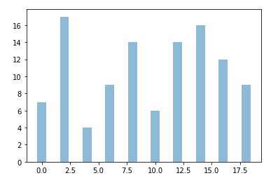
例子1: 如何生成一个柱状图
#最基础的柱状图
import random
import numpy as np
import matplotlib.pyplot as plt

#产生10个范围在0-20之间的整数, data=[7, 17, 4, 9, 14, 6, 14, 16, 12, 9]
np.random.seed(543)
data = np.random.randint(0,20,10)

#通过plt.bar()函数生成bar chart
plt.bar(np.arange(0,20,2), data, align='center', alpha=0.5)
plt.show()
- plt.bar(x, height, width=0.8, bottom=None, *, align=‘center’, data=None, *kwargs)
常用参数,官方文档:- x : 柱状图的每一个柱子的x坐标.
- height: 每个柱子的高度.
- width: 每个柱子的宽度.
- bottom: 每个柱子的起点是多少,默认0.
- align: 按照哪里对其,‘center’ 对齐x坐标的中间,‘edge’ 对齐x坐标的右侧.
- color: 每根柱子的颜色.
- alpha: 柱子的透明度,取值[0,1]
- tick_label: 每个柱子x轴上的标签.
- 结果:
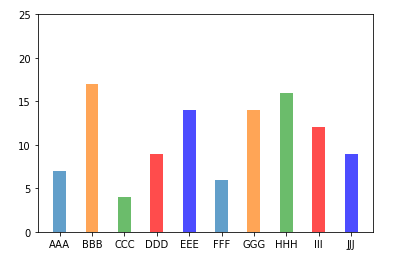
例子2:如何控制柱状图的颜色和下标
colors = ['#1f77b4', '#ff7f0e', '#2ca02c', 'r', 'b']
labels = ['AAA','BBB','CCC','DDD','EEE','FFF','GGG','HHH','III','JJJ']
data=[7, 17, 4, 9, 14, 6, 14, 16, 12, 9]

plt.bar(np.arange(0,20,2), data, align='center', alpha=0.7, color=colors, tick_label=labels)

#控制y轴的刻度
plt.yticks(np.arange(0,30,5))

#展示结果
plt.show()
坐标系的控制,例如 plt.yticks() 在另一篇文章中有较为详细的描述
结果:
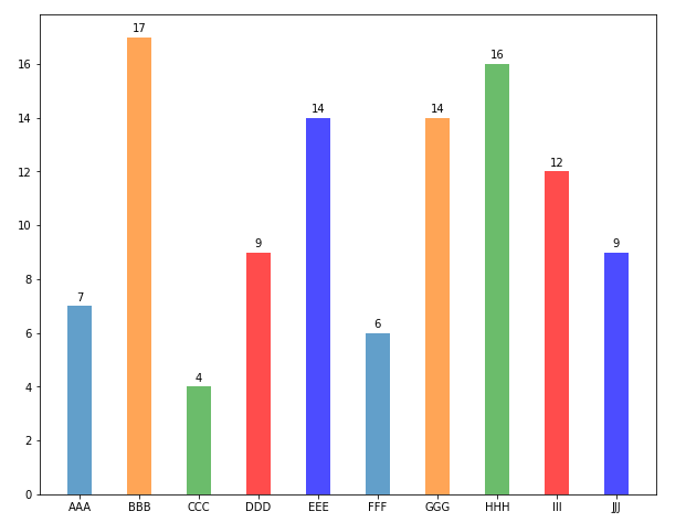
例子3:标注每个柱子的高度
#标注每个柱子上面加标注

#生成信息
colors = ['#1f77b4', '#ff7f0e', '#2ca02c', 'r', 'b']
labels = ['AAA','BBB','CCC','DDD','EEE','FFF','GGG','HHH','III','JJJ']
data=[7, 17, 4, 9, 14, 6, 14, 16, 12, 9]

#生成柱状图
fig, ax = plt.subplots(figsize=(10,8))
bars1 = plt.bar(np.arange(0,20,2), data, align='center', alpha=0.7, color=colors, tick_label=labels)

#给每个柱子上面添加标注
for b in bars1: #遍历每个柱子
  height = b.get_height()
  ax.annotate('{}'.format(height),
        #xy控制的是,标注哪个点,x=x坐标+width/2, y=height,即柱子上平面的中间
        xy=(b.get_x() + b.get_width() / 2, height),
        xytext=(0,3), #文本放置的位置,如果有textcoords,则表示是针对xy位置的偏移,否则是图中的固定位置
        textcoords="offset points", #两个选项 'offset pixels','offset pixels'
        va = 'bottom', ha = 'center' #代表verticalalignment 和horizontalalignment,控制水平对齐和垂直对齐。
        )

#展示结果
plt.show()
- plt.annotate(text, xy, *args, **kwargs)
主要参数,官方文档,另一篇文章的例4也有关于这个函数的补充 :- text: 要显示的文本
- xy: 它控制标注图中的哪个点
- xytext:文本放置的位置,如果有textcoords,则表示是针对xy位置的偏移,否则是图中的固定位置
- textcoords:两个选项 ‘offset pixels’,‘offset pixels’,文本偏移的单位是point 或 pixels
- va,ha :代表verticalalignment 和horizontalalignment,控制水平对齐和垂直对齐
- 结果:
例子4: 如何做并列的条形图
#Group Bar chart

import random
import numpy as np
import matplotlib.pyplot as plt
#生成信息
colors = ['#1f77b4', '#ff7f0e', '#2ca02c', 'r', 'b']
labels = ['AAA','BBB','CCC','DDD','EEE','FFF','GGG','HHH','III','JJJ']
data1 = [7, 17, 4, 9, 14, 6, 14, 16, 12, 9]
data2 = [22,  0, 26, 14, 21, 12,  6, 24,  0, 22]
width = 0.7
xpos = np.arange(0,20,2)

#生成柱状图
fig, ax = plt.subplots(figsize=(10,8))
bars1 = plt.bar(xpos-width/2, data1, align='center', width=width, alpha=0.9, color='#1f77b4', label = 'Category A')
bars2 = plt.bar(xpos+width/2, data2, align='center', width=width, alpha=0.9, color='#ff7f0e', label = 'Category B')

#设置每个柱子下面的记号
ax.set_xticks(xpos) #确定每个记号的位置
ax.set_xticklabels(labels)  #确定每个记号的内容

#给每个柱子上面添加标注
def autolabel(rects):
    """Attach a text label above each bar in *rects*, displaying its height."""
    for rect in rects:
        height = rect.get_height()
        ax.annotate('{}'.format(height),
              xy=(rect.get_x() + rect.get_width() / 2, height),
              xytext=(0, 3),  # 3 points vertical offset
              textcoords="offset points",
              ha='center', va='bottom'
              )
autolabel(bars1)
autolabel(bars2)

#展示结果
plt.legend()
plt.show()
- 并列的条形图,Group bar chart 其实是两/多个bar chart合并在一个坐标系上。
- 依旧可以使用plt.bar() 里面的tick_labels 参数定义每个柱子的下标,但是更常用的把一组柱子标记为一个记号。它可以通过ax.set_xticks(), 和ax.set_xticklabels() 两个函数在一起实现。其中ax.set_xticks(xpos)确定每个记号的位置,ax.set_xticklabels(labels)确定每个记号的内容
- 结果:
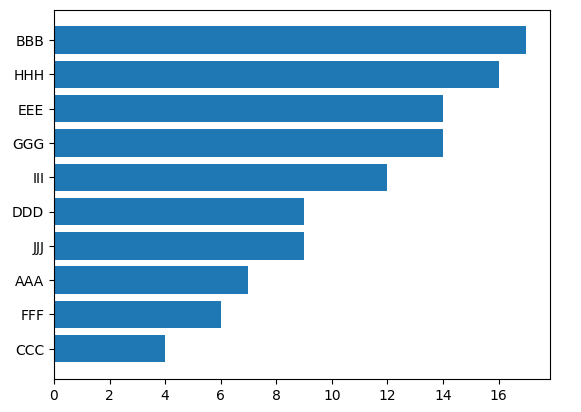
例子5: 如何做横向的条形图
import matplotlib.pyplot as plt
import numpy as np

fig, ax = plt.subplots()

labels = ['AAA','BBB','CCC','DDD','EEE','FFF','GGG','HHH','III','JJJ']
data1 = [7, 17, 4, 9, 14, 6, 14, 16, 12, 9]

indexes = np.argsort(-np.array(data1))
data1_sorted = [data1[i] for i in indexes]
labels_sorted = [labels[i] for i in indexes]

y_pos = np.arange(len(labels))

performance = 3 + 10 * np.random.rand(len(people))
error = np.random.rand(len(people))

ax.barh(y_pos, data1_sorted, align='center')
ax.set_yticks(y_pos)
ax.set_yticklabels(labels_sorted)
ax.invert_yaxis()  # labels read top-to-bottom

plt.show()
- plt.barh(y, width, height=0.8, left=None, *, align=‘center’, **kwargs)
常用函数和plt.bar() 几乎一致 - ax.invert_yaxis(),反转y坐标
- 结果:
最后
以上就是忧郁火龙果最近收集整理的关于Py-plt: Matplotlib常用柱状图详解Python - Matplotlib - 柱状图的全部内容,更多相关Py-plt:内容请搜索靠谱客的其他文章。
本图文内容来源于网友提供,作为学习参考使用,或来自网络收集整理,版权属于原作者所有。


发表评论 取消回复