注:本文的所有数据请移步—— 参考数据
文章目录
- 一、水平堆叠图
- 二、波浪形堆叠图
- 三、加上数据标签
一、水平堆叠图
堆叠图其实就是柱状图的一种特殊形式
from matplotlib import pyplot as plt
plt.style.use('seaborn')
plt.figure(figsize=(15,9))
plt.rcParams.update({'font.family': "Microsoft YaHei"})
plt.title("中国票房2021TOP9")
plt.bar(cnbodfgbsort.index,cnbodfgbsort.PERSONS)
plt.bar(cnbodfgbsort.index,cnbodfgbsort.PRICE)
plt.bar(cnbodfgbsort.index,cnbodfgbsort.points)
plt.show()
堆叠图效果
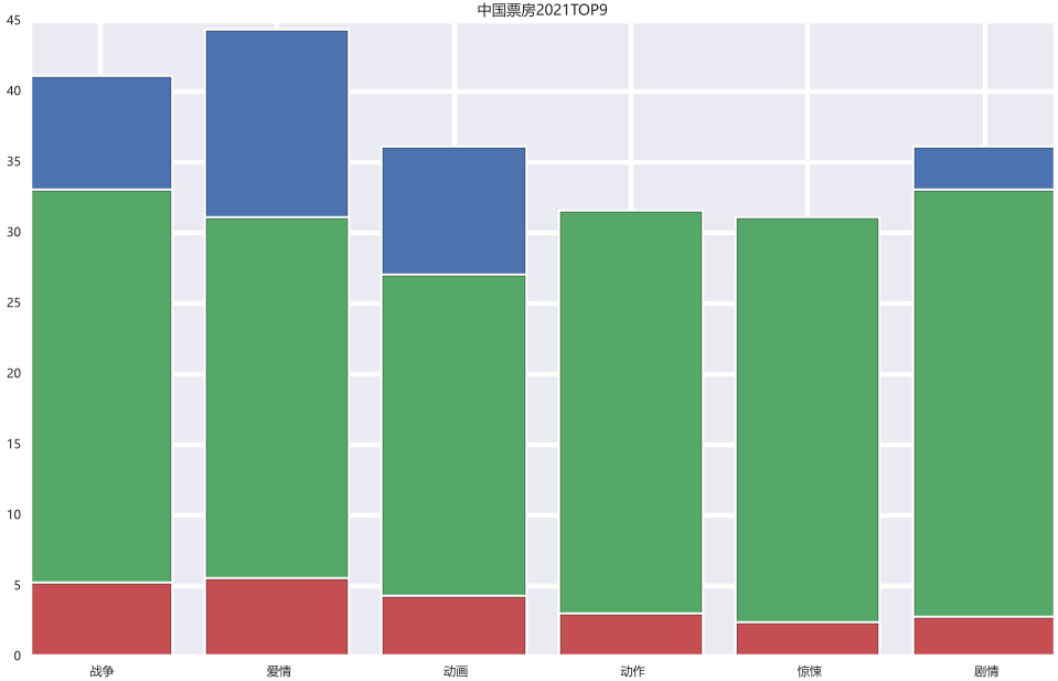
可以看到有部分蓝色的数据被遮挡了,如果我们想全部展现,可以:
index_x=np.arange(len(cnbodfgbsort.index))
index_x
w=0.15
from matplotlib import pyplot as plt
plt.style.use('classic')
plt.figure(figsize=(15,9))
plt.rcParams.update({'font.family': "Microsoft YaHei"})
plt.title("中国票房2021TOP9")
plt.bar(index_x,cnbodfgbsort.PERSONS,width=w)
plt.bar(index_x+w,cnbodfgbsort.PRICE,width=w)
plt.bar(index_x+2*w,cnbodfgbsort.points,width=w)
plt.show()
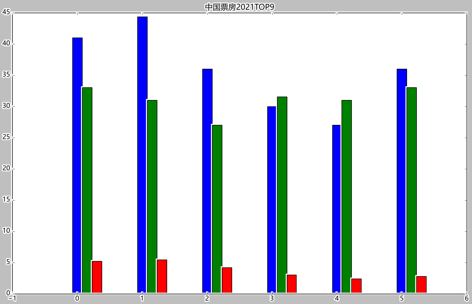
可以看到Excel的数据源当中BO与PRICE和PERSONS的数字相差过大,如果做堆叠图的话,BO会将其他的都进行覆盖,无法显示好的效果:

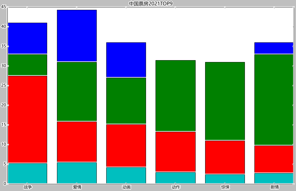
因为数据相差实在太大,我们可以直接让BO除以1000:
from matplotlib import pyplot as plt
plt.style.use('classic')
plt.figure(figsize=(15,9))
plt.rcParams.update({'font.family': "Microsoft YaHei"})
plt.title("中国票房2021TOP9")
plt.bar(cnbodfgbsort.index,cnbodfgbsort.PERSONS)
plt.bar(cnbodfgbsort.index,cnbodfgbsort.PRICE)
plt.bar(cnbodfgbsort.index,cnbodfgbsort.BO/1000)
plt.bar(cnbodfgbsort.index,cnbodfgbsort.points)
plt.show()
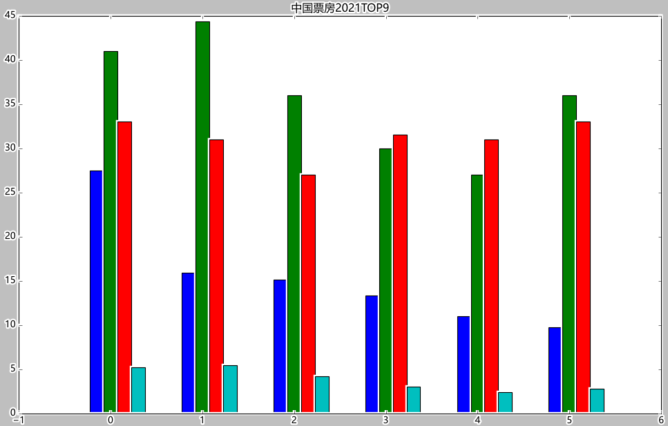
from matplotlib import pyplot as plt
plt.style.use('classic')
plt.figure(figsize=(15,9))
plt.rcParams.update({'font.family': "Microsoft YaHei"})
plt.title("中国票房2021TOP9")
plt.bar(index_x-w,cnbodfgbsort.BO/1000,width=w)
# 直接让BO除以1000
plt.bar(index_x,cnbodfgbsort.PERSONS,width=w)
plt.bar(index_x+w,cnbodfgbsort.PRICE,width=w)
plt.bar(index_x+2*w,cnbodfgbsort.points,width=w)
plt.show()
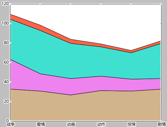
二、波浪形堆叠图
labels=['战争','爱情','动画','动作','惊悚','剧情']
colors=['tan','violet','turquoise','tomato','teal','steelblue']
plt.stackplot(cnbodfgbsort.index,cnbodfgbsort.PRICE,cnbodfgbsort.PERSONS,cnbodfgbsort.points,labels=labels,colors=colors)

labels=['战争','爱情','动画','动作','惊悚','剧情']
colors=['tan','violet','turquoise','tomato','teal','steelblue']
plt.stackplot(cnbodfgbsort.index,cnbodfgbsort.PRICE,cnbodfgbsort.BO/900,cnbodfgbsort.PERSONS,cnbodfgbsort.points,labels=labels,colors=colors)
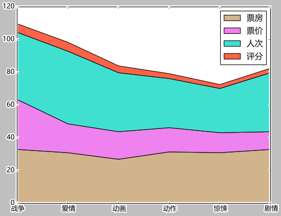
三、加上数据标签
plt.legend()
labels=['票房','票价','人次','评分']
colors=['tan','violet','turquoise','tomato','teal','steelblue']
plt.stackplot(cnbodfgbsort.index,cnbodfgbsort.PRICE,cnbodfgbsort.BO/900,cnbodfgbsort.PERSONS,cnbodfgbsort.points,labels=labels,colors=colors)
plt.legend()
最后
以上就是醉熏树叶最近收集整理的关于Python matplotlib 堆叠图一、水平堆叠图二、波浪形堆叠图三、加上数据标签的全部内容,更多相关Python内容请搜索靠谱客的其他文章。
本图文内容来源于网友提供,作为学习参考使用,或来自网络收集整理,版权属于原作者所有。
![[python]关于opencv读取图片时,颜色发生变化后,如何修改?](https://www.shuijiaxian.com/files_image/reation/bcimg19.png)


发表评论 取消回复