// 指定图表的配置项和数据
var option = {
tooltip: {
trigger: 'item',
formatter: "{a} <br/>{b}: {c} ({d}%)"
},
color:["#27D9C8","#D8D8D8"],
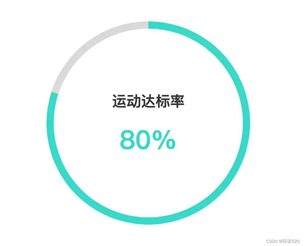
title:{
text:"80%",
left:"center",
top:"50%",
textStyle:{
color:"#27D9C8",
fontSize:36,
align:"center"
}
},
graphic:{
type:"text",
left:"center",
top:"40%",
style:{
text:"运动达标率",
textAlign:"center",
fill:"#333",
fontSize:20,
fontWeight:700
}
},
series: [
{
name: '运动情况',
type: 'pie',
radius: ['65%', '70%'],
avoidLabelOverlap: false,
label: {
normal: {
show: false,
position: 'center'
},
},
data: [
{ value: 80, name: '已完成' },
{ value: 20, name: '未完成' },
]
}
]
};
最后
以上就是义气西牛最近收集整理的关于Echarts 饼图中间添加文字、title、graphic的全部内容,更多相关Echarts内容请搜索靠谱客的其他文章。
本图文内容来源于网友提供,作为学习参考使用,或来自网络收集整理,版权属于原作者所有。


发表评论 取消回复