一、基本概念
1、数据分析及可视化的概念。
数据分析常用于商业决策,挖掘消费模式,优化资源配置以打到利益最大化。为了使数据更加直观清晰的呈现在人们面前,我们需要考虑用合适的方式和方法对数据进行可视化操作。

2、数据分析可视化流程。
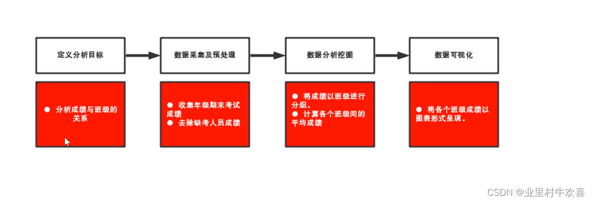
3、数据分析可视化案例。
一个简单例子,用numpy的正选函数设置一个正选函数曲线,用matplotlib画出来。
#encoding=utf-8
import numpy as np
from numpy.linalg import *
def starMain():
    #line
    import matplotlib.pyplot as plt
    x = np.linspace(-np.pi,np.pi,256,endpoint=True)#设置区间为-np.pi,np.pi
    c,s=np.cos(x),np.sin(x)#使用一个正玄函数
    plt.figure(1)#指定1个图
    # 绘画
    plt.plot(x,c)
    plt.plot(x,s)
    plt.show()


if __name__== "__main__":
    starMain()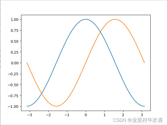
4、数据分析可视化的工具。
Matplotlib工具,下列地址是matplotlib的官方API使用。
matplotlib.pyplot.subplot — Matplotlib 3.5.2 documentationhttps://matplotlib.org/stable/api/_as_gen/matplotlib.pyplot.subplot.html?highlight=subplot#matplotlib.pyplot.subplot
二、环境安装
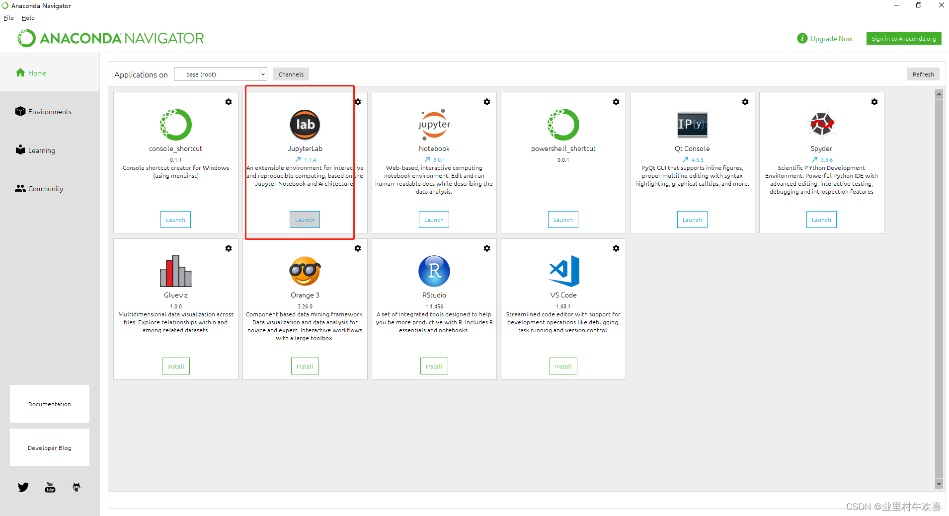
1、anacanda安装
建议看我这篇文章,介绍Anaconda的安装。(下列展示细节方面我用的Pycharm来操作,看各位喜欢用哪个IDE,哪个IDE都有自己独特的方式。)
Python-IDE舍弃Pycharm追求Anacanda之旅_业里村牛欢喜的博客-CSDN博客快到年底了,写总结报告了,总想用数据图形来汇报,于是想用Python的第三方包来解决数据呈现和数据分析。了解到pyecharts包。https://pyecharts.org/#/zh-cn/geography_charts(官方网站介绍,想用就看官方的,别人写的文章只能借鉴。)实例操作1:(挖坑to be no.1)1、打开安装完好的Pycharm,将代码复制进去,不急着运行。(...https://blog.csdn.net/yi247630676/article/details/103671763?spm=1001.2014.3001.5502
2、Jupyter Notebook的安装使用
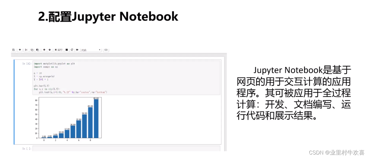
(1)、conda创建新的python环境并启用。
(2)、conda安装Jupyter Notebook
(3)、启动Jupyter Notebook
3、画图工具matplotlib使用。(matplotlib使用不需要每行代码使用plt.show())
三、Matplot的基本使用方式。
1、基本设置。
Matplotlib是一个Python的2D绘图哭,它以各种硬拷贝格式和跨平台的交互式环境生成出版质量级别的图形。(如果是在Jupyter Notebook实现的话,不需要加plt.show()代码,但是在pycharm中需要加plt.show().)
例子:
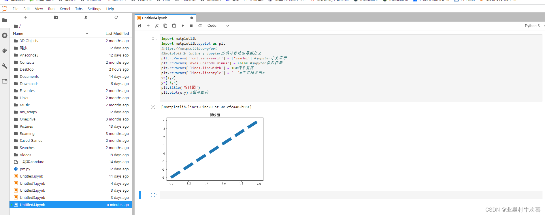
import matplotlib
import matplotlib.pyplot as plt
#https://matplotlib.org/api
#%matplotlib inline ;jupyter的编译器输出需要加上
plt.rcParams['font.sans-serif'] = ['SimHei'] #jupyter中文表示
plt.rcParams['axes.unicode_minus'] = False #jupyter负数表示
plt.rcParams['lines.linewidth'] = 10#线条宽度
plt.rcParams['lines.linestyle'] = '--'#定义线条形状
x=[1,2]
y=[-3,4]
plt.title('折线图')
plt.plot(x,y) #图形结构
plt.show()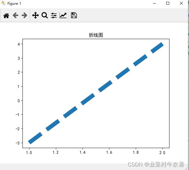
2、直方图、条形图、折线图、饼图
直方图案例:
import matplotlib
import matplotlib.pyplot as plt
import matplotlib as mpl
plt.rcParams['font.sans-serif'] = ['SimHei'] #中文表示
plt.rcParams['axes.unicode_minus'] = False #负数表示
height = [168,155,182,170,173,161,155,173,176,181,166,172,170]
bins = range(150,191,5)
plt.hist(height,bins=bins)#直方图
plt.show()
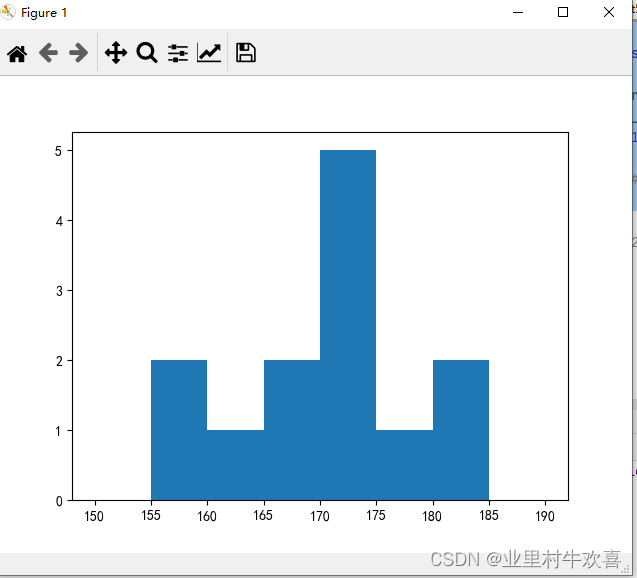
条形图案例:
import matplotlib
import matplotlib.pyplot as plt
import matplotlib as mpl
plt.rcParams['font.sans-serif'] = ['SimHei'] #中文表示
plt.rcParams['axes.unicode_minus'] = False #负数表示
classes=['class1','class2','class3']
scores = [70,80,60]
plt.bar(classes,scores)
plt.show()
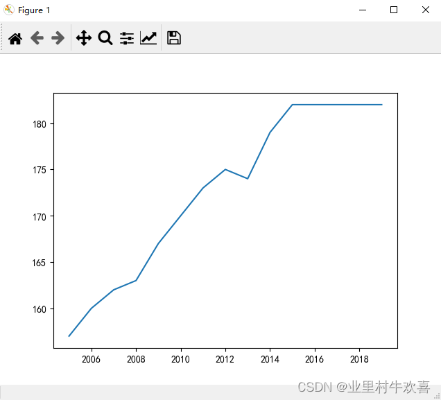
折线图案例:
import matplotlib
import matplotlib.pyplot as plt
import matplotlib as mpl
plt.rcParams['font.sans-serif'] = ['SimHei'] #中文表示
plt.rcParams['axes.unicode_minus'] = False #负数表示
year = range(2005,2020)
height = [157, 160, 162, 163, 167, 170, 173, 175, 174, 179, 182, 182, 182, 182, 182]
plt.plot(year,height)#线形图,x,y的坐标数量要对应
plt.show()
饼图案例:
import matplotlib
import matplotlib.pyplot as plt
import matplotlib as mpl
plt.rcParams['font.sans-serif'] = ['SimHei'] #中文表示
plt.rcParams['axes.unicode_minus'] = False #负数表示
labels = ['房贷','饮食','出行','教育']
data = [8000,2000,2000,3000]
plt.pie(data,labels=labels,autopct='%1.1f%%')#定义饼图,%1.1f定义百分比数。%%是定义百分号
plt.show()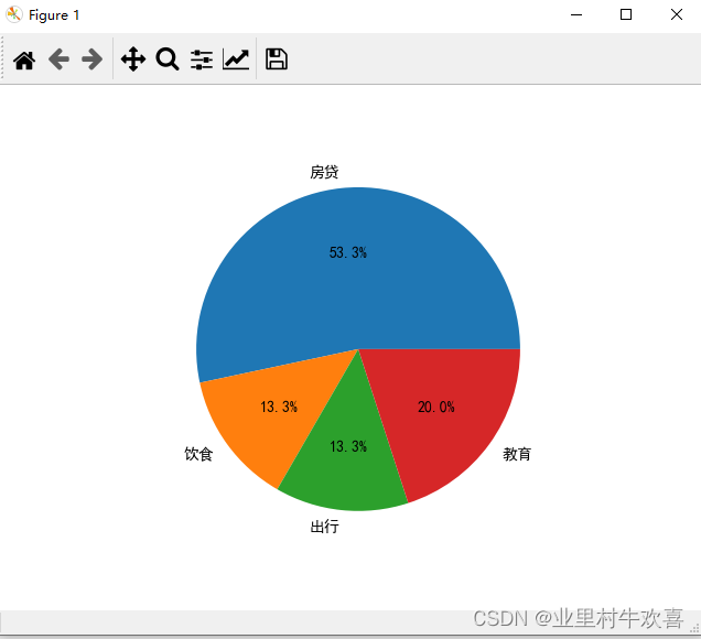
3、散点图、箱线图
散点图:
import matplotlib
import matplotlib.pyplot as plt
import matplotlib as mpl
plt.rcParams['font.sans-serif'] = ['SimHei'] #中文表示
plt.rcParams['axes.unicode_minus'] = False #负数表示
data=[[18.9,10.4],[21.3,8.7],[19.5,11.6],[20.5,9.7],[19.9,9.4],[22.3,11],[21.4,10.6],[9,9.4],[10.4,9],
      [9.3,11.3],[11.6,8.5],[11.8,10.4],[10.3,10],[9.7,8.5],[13.4,18],[16.4,15]]
X=[item[0] for item in data]
Y=[item[1] for item in data]
print(X,Y)
plt.scatter(X,Y)
plt.title('超市商品价格与销量散点图')
plt.xlabel('价格(元)')
plt.ylabel('销量(件)')
plt.text(16,16,'牙膏')#坐标16,16的地方添加文本。
plt.text(10,12,'纸巾')
plt.text(20,10,'洗衣服')
plt.show()#散点图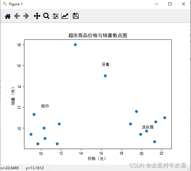
箱线图:
import matplotlib
import matplotlib.pyplot as plt
import matplotlib as mpl
plt.rcParams['font.sans-serif'] = ['SimHei'] #中文表示
plt.rcParams['axes.unicode_minus'] = False #负数表示
data = [77,70,64,45,66,12,78,98,67,87,97,67,97,65,87,67,99,66,88,56,78,89,88]
plt.boxplot(data)#箱线图
plt.show()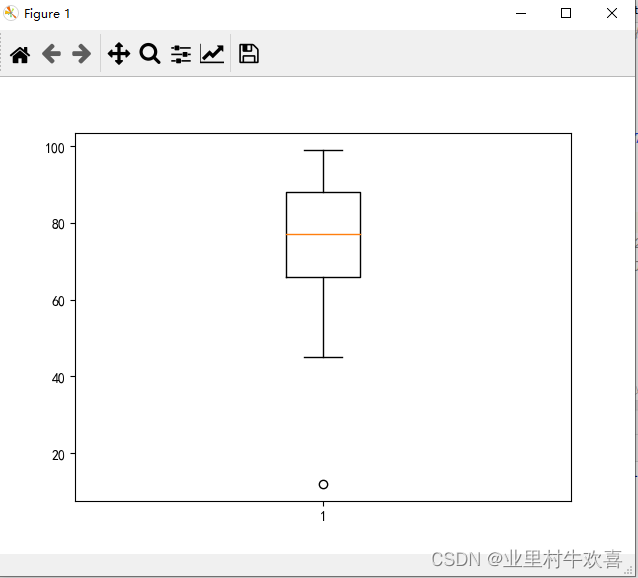
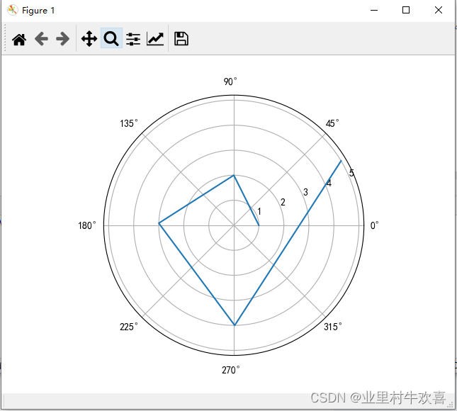
4、极限图、梯形图
极限图:
import matplotlib
import matplotlib.pyplot as plt
import matplotlib as mpl
plt.rcParams['font.sans-serif'] = ['SimHei'] #中文表示
plt.rcParams['axes.unicode_minus'] = False #负数表示
r=[1,2,3,4,5]#极经
theta = [0.0,1.57084329429421989,3.1141523192839189,4.72138921838,6.82389128174878]#角度
ax = plt.subplot(111,projection='polar')#定义极限图
ax.plot(theta,r)
plt.show()
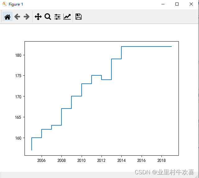
梯形图:
import matplotlib
import matplotlib.pyplot as plt
import matplotlib as mpl
plt.rcParams['font.sans-serif'] = ['SimHei'] #中文表示
plt.rcParams['axes.unicode_minus'] = False #负数表示
year = range(2005,2020)
height = [157, 160, 162, 163, 167, 170, 173, 175, 174, 179, 182, 182, 182, 182, 182]
plt.step(year,height)#定义折线图
plt.show()
四、Matplotlib高级用法
1、图标参数配置
参数plt的参数值,配置时注意正负数,还有百分比数。
2、堆积图
import matplotlib
import matplotlib.pyplot as plt
import matplotlib as mpl
plt.rcParams['font.sans-serif'] = ['SimHei'] #jupyter中文表示
plt.rcParams['axes.unicode_minus'] = False #jupyter负数表示

x=[1,2,3]
y=[80,85,87]
name=['class1','class2','class3']
plt.bar(x,y)
plt.title('三班成绩柱状图')
plt.xlabel('班级数量')
plt.ylabel('成绩')
plt.xticks(x,name)
# plt.text(1,81,80)#找到X,Y的指标,然后在柱状图上面增加数字。
for i in range(1,4):
    plt.text(i,y[i-1]+1,y[i-1])#找寻到每个坐标点位
plt.show()#堆积图的绘制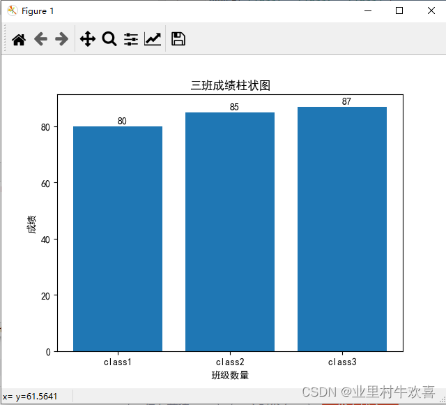
3、分块图
import matplotlib
import matplotlib.pyplot as plt
import matplotlib as mpl#f分块图
plt.rcParams['font.sans-serif'] = ['SimHei'] #jupyter中文表示
plt.rcParams['axes.unicode_minus'] = False #jupyter负数表示
ch=[72,80,66,77,92]
math=[62,92,72,75,88]
eng=[76,81,73,75,80]
plt.bar(range(1,6),ch,color='r',label='chinese')
plt.bar(range(1,6),math,bottom=ch,color='g',label='math')
chmath=[ch[i]+math[i] for i in range(5)]
plt.bar(range(1,6),eng,bottom=chmath,color='b',label='english')
plt.show()#分块图的绘制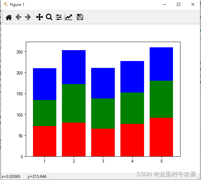
4、 柱形图:
import matplotlib
import matplotlib.pyplot as plt
import matplotlib as mpl#f分块图
plt.rcParams['font.sans-serif'] = ['SimHei'] #jupyter中文表示
plt.rcParams['axes.unicode_minus'] = False #jupyter负数表示
name_list=['chin','math','eng']
c1=[72.80,50,77.92]
c2=[62.1,72,75.90]
c3=[76.81,73,72.8]
width=0.4
x=[1,3,5]
plt.bar(x,c1,label='class1',fc='r',width=width)
x=[1.4,3.4,5.4]
plt.bar(x,c2,label='class2',fc='b',width=width)
x=[1.8,3.8,5.8]
plt.bar(x,c3,label='class3',fc='y',width=width)
plt.xticks(x,name_list)
plt.legend()
plt.title('三个班考试成绩')
plt.xlabel('科目')
plt.ylabel('成绩')
plt.show()#柱状图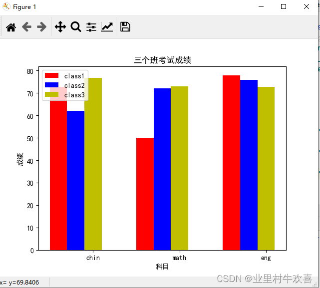
5、气泡图案例:
import matplotlib
import matplotlib.pyplot as plt
import matplotlib as mpl#f分块图
plt.rcParams['font.sans-serif'] = ['SimHei'] #jupyter中文表示
plt.rcParams['axes.unicode_minus'] = False #jupyter负数表示
x=[22,22,34,23,54,23,23,53,41,34,42,42,44,12,43,45,67,87,56,78]
y=[176,186,164,177,284,193,160,189,219,198,198,179,187,174,181,172,173,172,188,177]
z=[70,220,195,129,180,168,210,160,168,150,299,200,148,195,169,128,160,184,190,190]
plt.scatter(x,y,s=z)#气泡图,z是气泡大小。
plt.show()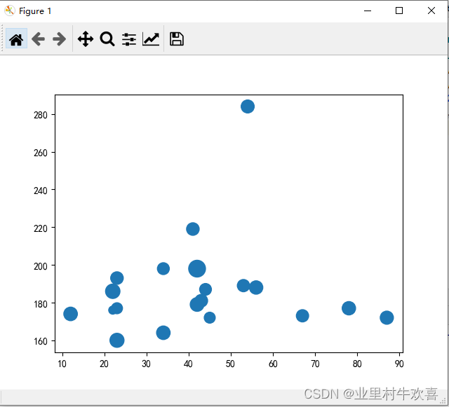
五、案例分析
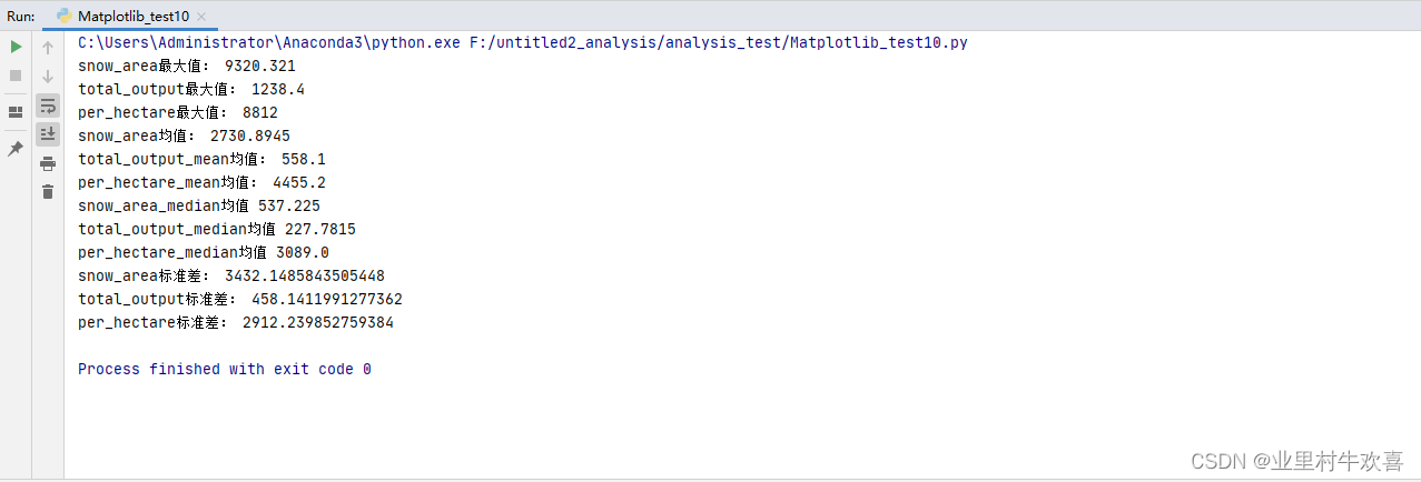
1、数据处理分析
首先将数据预处理,缺失值,空值,还有不等值也可以剔除掉,然后再引用math函数进行处理。
代码部分:
import matplotlib
import matplotlib.pyplot as plt
import matplotlib as mpl#f分块图
plt.rcParams['font.sans-serif'] = ['SimHei'] #jupyter中文表示
plt.rcParams['axes.unicode_minus'] = False #jupyter负数表示
snow_area=[83.1,3915.7,593.2,2901.5,445.5,208.5,481.25,9320.321,8987.984,371.89]
total_output=[72.123,232.239,1232.9,923.234,1033.25,223.1,189.23,1238.4,223.324,213.2]
per_hectare=[8812,1230,8723,2138,3459,3894,8808,2719,2389,2380]
area=['北京','天津','河北','山西','内蒙古','辽宁','吉林','黑龙江','上海','江苏']

#最大值,均值,中位值,标准
#最大值
snow_area_max=max(snow_area)
print('snow_area最大值:',snow_area_max)
total_output_max=max(total_output)
print('total_output最大值:',total_output_max)
per_hectare_max=max(per_hectare)
print('per_hectare最大值:',per_hectare_max)

#均值
snow_area_mean=sum(snow_area)/len(snow_area)
print('snow_area均值:',snow_area_mean)
total_output_mean=sum(total_output)/len(total_output)
print('total_output_mean均值:',total_output_mean)
per_hectare_mean=sum(per_hectare)/len(per_hectare)
print('per_hectare_mean均值:',per_hectare_mean)

#中位值
#1,2,3 1,2,3,4.
def median(List):
    List=sorted(List)
    if len(List)%2==1:
        return List[len(List)//2]
    else:
        return (List[len(List)//2]+List[len(List)//2-1])/2
snow_area_median=median(snow_area)
print('snow_area_median均值',snow_area_median)
total_output_median=median(total_output)
print('total_output_median均值',total_output_median)
per_hectare_median=median(per_hectare)
print('per_hectare_median均值',per_hectare_median)

#标准差
import math
def stdev(list):
    mean=sum(list)/len(list)
    Sum=0
    for item in list:
        Sum += (item-mean)**2
    Sum/=len(list)
    return math.sqrt(Sum)
snow_area_stdev=stdev(snow_area)
print('snow_area标准差:',snow_area_stdev)
total_output_stdev=stdev(total_output)
print('total_output标准差:',total_output_stdev)
per_hectare_stdev=stdev(per_hectare)
print('per_hectare标准差:',per_hectare_stdev)
执行结果:
2、可视化结果输出
因为书写方便,将三个图形代码放在一个图标里面展示,源数据基本一样,就是数据展示的效果有三种,直观图、饼图、还有气泡图,可分别在不同的代码Demo下执行。
import matplotlib
import matplotlib.pyplot as plt
import matplotlib as mpl#f分块图
plt.rcParams['font.sans-serif'] = ['SimHei'] #jupyter中文表示
plt.rcParams['axes.unicode_minus'] = False #jupyter负数表示
snow_area=[83.1,3915.7,593.2,2901.5,445.5,208.5,481.25,9320.321,8987.984,371.89]
total_output=[72.123,232.239,1232.9,923.234,1033.25,223.1,189.23,1238.4,223.324,213.2]
per_hectare=[8812,1230,8723,2138,3459,3894,8808,2719,2389,2380]
area=['北京','天津','河北','山西','内蒙古','辽宁','吉林','黑龙江','上海','江苏']
#柱状图
plt.figure(figsize=(20,10))#设置X坐标的油标的宽度,高度
plt.bar(range(1,len(snow_area)+1),snow_area)
plt.xticks(range(1,len(snow_area)+1),area)
plt.xlabel('省份')
plt.ylabel('降雪面积')
plt.title('各省降雪面积')
plt.show()
#饼图
plt.figure(figsize=(50,50))
plt.pie(snow_area,labels=area,autopct="%1.1f%%")
plt.title('各省降雪面积占比图')
plt.show()
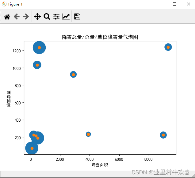
#气泡图、反应降雪面积,降雪总量和单位降雪量
per_hectare=[item/10 for item in per_hectare]
plt.scatter(snow_area,total_output,s=per_hectare)#设置气泡坐标轴
plt.xlabel('降雪面积')
plt.ylabel('降雪总量')
plt.title('降雪总量/总量/单位降雪量气泡图')
plt.scatter(snow_area,total_output)
plt.show()柱状图: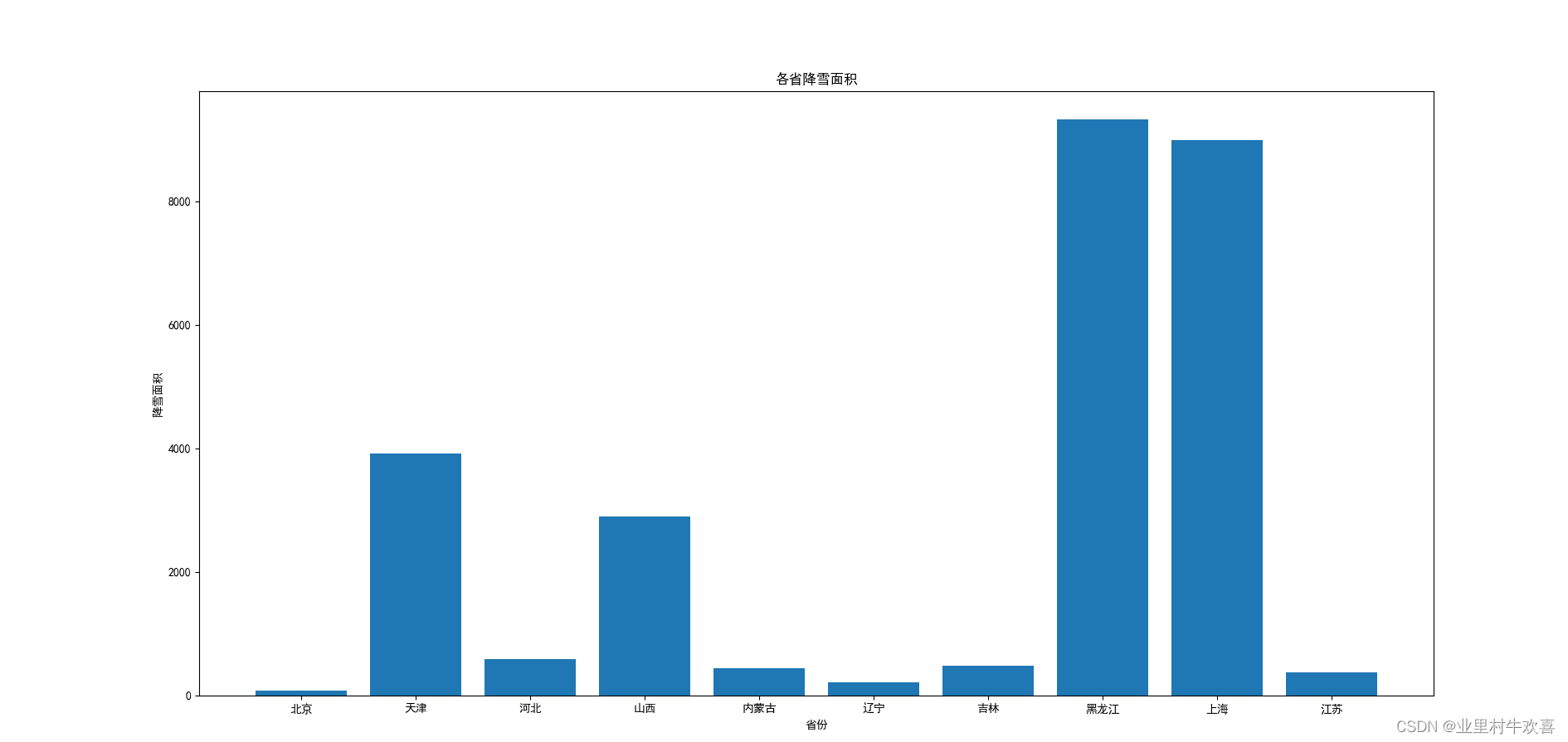
饼图:
气泡:
扩展引用正弦函数的来绘画例子,有兴趣可以试一试:
#encoding=utf-8
import numpy as np
from numpy.linalg import *
def starMain():
    #line绘制一个正弦函数
    import matplotlib.pyplot as plt
    x = np.linspace(-np.pi,np.pi,256,endpoint=True)
    c,s=np.cos(x),np.sin(x)
    plt.figure(1)
    plt.plot(x,c,color="blue",linewidth=1.0,linestyle="-",label="COS",alpha=0.5)#设置颜色,线型,线宽,标签
    plt.plot(x,s,"r*",label="SIN")
    plt.title("COS & SIN")
    #绘制正玄函数坐标。
    ax=plt.gca()#轴编辑器
    ax.spines["right"].set_color("none")
    ax.spines["top"].set_color("none")
    ax.spines["left"].set_position(("data",0))
    ax.spines["bottom"].set_position(("data",0))
    ax.xaxis.set_ticks_position("bottom")
    ax.yaxis.set_ticks_position("left")
    plt.xticks([-np.pi, -np.pi /2,0, np.pi / 2,np.pi]),[r'$-pi$',r'$-pi/2$',r'$0$',r'$+pi/2$']
    plt.yticks(np.linspace(-1,1,5,endpoint=True))
    #设置XY轴距的数值
    for lable in ax.get_xticklabels()+ax.get_yticklabels():
        lable.set_fontsize(16)
        lable.set_bbox(dict(facecolor="white",edgecolor="None",alpha=0.2))
    plt.legend(loc="upper left")#图例
    plt.grid()#网格线
    # plt.axis([-1,1,-0.5,1])#显示范围,前两个横轴,后两个参数纵轴
    plt.fill_between(x,np.abs(x)<0.5,c,c>0.5,color="green",alpha=0.25)#进行判断填充
    t=1
    plt.plot([t,t],[0,np.cos(t)],"y",linewidth=3,linestyle="--")#注释添加黄线
    plt.annotate("cos(1)",xy=(t,np.cos(1)), xycoords="data", xytext=(+10,+30),textcoords="offset points",arrowprops=dict(arrowstyle="->",connectionstyle="arc3,rad=.2"))#添加黄线标记位置

    plt.show()


if __name__== "__main__":
    starMain()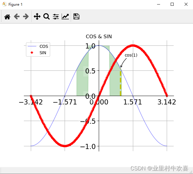
总结: matplotlib使用简单,绘画比较方便,注意X,Y轴的使用,还有标题title的使用。注意使用前,将数据进行预处理,清洗不需要的数据还有错误的数据,才能有效的数据化,可视化。
代码有深度,创造无极限。
感谢慕课老师:图标参数配置,数据可视化利器之Matplotlib教程-慕课网 https://www.imooc.com/video/20318
matplotlib的API:
matplotlib.pyplot.subplot — Matplotlib 3.5.2 documentationhttps://matplotlib.org/stable/api/_as_gen/matplotlib.pyplot.subplot.html?highlight=subplot#matplotlib.pyplot.subplot
最后
以上就是舒心鸡翅最近收集整理的关于Python数据可视化工具matpoltlib使用的全部内容,更多相关Python数据可视化工具matpoltlib使用内容请搜索靠谱客的其他文章。


发表评论 取消回复